 |
INTEGRATED COMPANY ANALYSIS |
Co. vs. Industry |
<< previous next >> |
1 of 1 |
|
INTEGRATED COMPANY ANALYSIS |
Co. vs. Industry |
<< previous next >> |
1 of 1 |
|
|
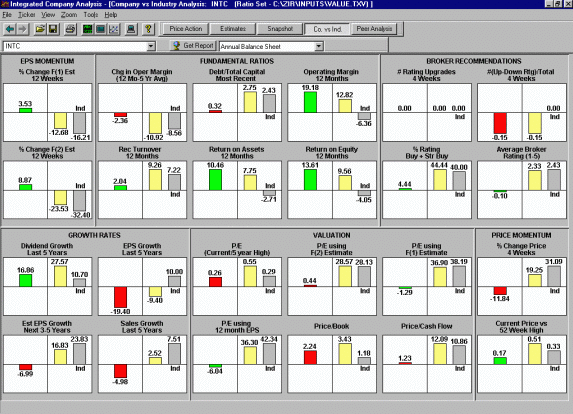
Company vs. Industry Analysis | ||||||||
|
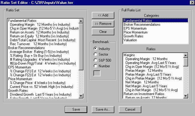
- The Company vs. Industry Analysis display is great for showing how a stock measures up against your favorite stock-picking criteria. You can graphically evaluate the investment attractiveness of a company versus the industry median, sector median, S&P 500, or a specific value/number. - Choose from pre-formatted Ratio Sets
that - The yellow bar represents the company
and
- If a company's ratio beats its
benchmark, |
|||||||||